About the color
Color, a visual element, is not only aesthetically pleasing but also carries a deep expressive language. Each tone of color not only represents a visual shade but also connects with moods, emotions, and memories. For instance, blue often evokes images of the sky and the sea, creating a sense of tranquility and freedom; whereas red can stimulate feelings of passion and intensity.
Color also has the profound ability to affect the human mind and emotions. For example, soft tones like pastels can bring about a sense of gentleness and peace, while bright, vibrant colors like neon can evoke feelings of excitement and energy.
Moreover, across different cultures and traditions, color plays a significant role in expressing and conveying values, beliefs, and the psychology of a community or nation.
In daily life, colors are not just shades on a canvas but the subtle language of the emotions and moods we experience. "When Colors Speak" is an intriguing topic we will explore, where each color can transform your living space.
Cùng lắng nghe tiếng nói của màu sắc qua nghệ thuật pha trộn màu sắc trong thiết kế:
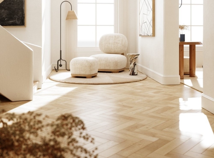
1. Monochromatic Scheme: Using one color tone and its variations (light, dark, deep).
.png)
2. Analogous Scheme: Using colors that are next to each other on the color wheel. Choose one dominant color to be used the most, then select a second adjacent color for important accents, and a third neighboring color for additional interior decoration details.
.png)
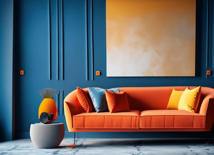
3. Complementary Scheme: Utilize pairs of colors that are opposite each other on the color wheel. Select one dominant color and then choose its complementary color as the secondary accent.
.png)
4. Triadic Scheme: Employ three colors that are evenly spaced around the color wheel, forming an equilateral triangle. These three colors, positioned at different points on the color circle, combine and complement each other to create a balanced and harmonious color scheme.
.png)
5. Split-complementary: Using three colors located at three different points on the color wheel that form an isosceles triangle.
.png)
6. Rectangular Tetradic hay Compound Complementary: Using two complementary color pairs, with careful attention to balancing warm colors (red, orange, or yellow) and cool colors (blue, green, or purple).
.png)
Note: Color Distribution for the Room
Distribute colors according to the 60-30-10 rule:
- 60% of the room should feature the dominant or base color.
- 30% should be the secondary color.
- 10% should be the accent color.
Photo: Collected.


